Showing posts with label photoshop. Show all posts

Monday, April 9, 2012

Tutorial: Create a Webpage With Photoshop part 1


This is how I created my webpage. It took some trial and error and at times I
was seriously Bent Out Of Shape. There was was no one tutorial with all the steps I needed to do. I thought I’d share what I learned so that other struggling DIYers could avoid the frustration! This tutorial just covers your basic landing page with active links. Anything with fancy bells and whistles you’d better get someone else to show you or, if you can afford it, do it for you. There are
a lot of steps but they are not hard steps.

1. I am assuming that you already have a domain name and a webhost already. Some
companies will even offer free, basic web hosting if you buy your domain through them. (Sometimes the catch is they slap their big dumb logo on top of your page, though. Not cool, Go Daddy.) Some hosting companies, like iPage, will offer free website building software that you can drag and drop your pictures and links into a template and it’s super easy to use. The downside is that their templates cannot be altered. I wanted things my way so I did it the hard way. It’s not too hard though! You can do it too!

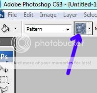
2. Open a new document in Photoshop. It should be 1040 pixels by 768 pixels. This is the standard size of most computer screens.

3. Name your document exactly the name of your website. If your website’s name is ILuvDoodling.com then that should be the name of the document. The reason for this is that later, when your page is live online, this name will appear on the search engine tabs. If you name it something like Webpage Design.jpg then that name will appear on the tabs and that’s confusing.

4. In your Photoshop document create a background. For now I suggest that you make our background white. When you get your page online, on some computers there will show a large white chunk on the side if the screen resolution is larger than 1040 pixels wide. I have not figured out how to avoid this. If you know, or find out, post the solution in comments!*

5. Add your logo, a banner with the name of your website and some text that will ater be made into clickable links such as: Etsy Shop, My Blog, Gallery etc. and space them out a bit.
6. Once you have your page looking the way you want it, flatten any layers, and save. (You
should probably also save a PSD file with the layers intact if you want to update things later.)
7. Now comes the web-pagey part! Over in your toolbar there is a tool called “Slice Tool.” Select it. Use it to drag boxes around anything that you’d like to be a clickable link.
8. Once you have a slice box around everything thatyou want to be a link, go back over to the tool bar and right click on Slice Tool. From the little drop down box, click “Slice Select Tool.” Each of your slice boxes has a little blue square with a number in it. Double click this and a dialogue box pops up. Where it says “Name” type the name of your link. It should be the same as
whatever the text on the page says i.e. “My Blog.” Where it says “URL” type the exact web
address of where you want that link to go
. Click OK when you’re done. Repeat this step for each of the slice boxes.

9. Okay, now comes a tricky bit. Save your document, Ctrl>S. Now, go to File>Save>Save for Web & Devices. This big complicated looking box pops up but don’t be alarmed, all you have to do is click save BUT, and this is the tricky part, when you save it, you need to save it as a new file called Index.html. It doesn’t matter what your page’s name is. It MUST be named Index.html. The reason is that when you upload to your webhost, this is the standard name that every server uses to understand ‘hey, this means it’s a webpage.’ You name it anything else, it’s not going to know what you’re talking about and your page will not show up.


10. Find the document on your computer that you named “Index.html”
and click on it
. Ta-da! This is what your webpage is going to look like online. You can see it but nobody else can…yet! Take this opportunity to fix or move anything that you don’t like. Click on and test all of your links to see if they’re going to the right places. Notice up in the tab it’ll have
the name of that original document, even though you named it ‘html’ clever huh? I don’t know how it knows, it just does!
Part 2 tomorrow: Getting your webdesign online!
* I DID find out how to fix this but it's tricky and involves tinkering around with your page's HTML code. I found this tutorial by Dave Kristula that shows what code to write and where to put it.

Monday, May 2, 2011

Making a Set of Patterns Tutorial

After you've mastered making repeating patterns, you may need to use them again and again for mockups or digital scrapbooking or similar.  However, if you just leave every pattern you create in your patterns palette it will considerably slow down your computer when you try to run Photoshop.  But reopening every jpeg tile and doing edit>define pattern is tedious.  Making a pattern set that you can load when you need it is much more convienient.
*Open all of the tiled patterns you want to use and save them to your patterns palette by clicking edit>define pattern.  You don't want to open and save every single pattern you've ever made all at once though.  As I said before, too many patterns in the palette will slow everything down.  Group them together by category i.e. Halloween or Florals or group them as collections that all fit together.

*In Photoshop, click on the patterns palette to open it.  Then click the little black arrow on the right side of the box to open the options.  Choose preset manager from that drop down menu.

*Now delete any of the pre-made patterns that are already in there that you don't need to be part of your new group.  Don't worry, you won't be deleting them from Photoshop altogether, just from the new group.  Hit your ctrl button to select more than one at the same time.  Be careful not to accidentally select any of the new ones.

When you have only the patterns you want hit ctrl>a to select them all and click save set.


Photoshop will automatically save this grouping in its patterns file.   All you need to do is select a name.  When you want to use them open the patterns palette, and click load patterns from the drop down menu. It should take you right to your saved files and you can load it from there.

Friday, August 13, 2010

The cure for Slooow Mo Joe


Lately, my computer has been super slooooooww. I've been worried that it was a virus although my anti-virus hasn't noticed anything. Photoshop has been particularly troublesome starting out a bit pokey and ending up taking up to FIVE minutes to load. I'd turn it on, get a drink, unload the dishwasher, allow myself to be distracted by the TV for a bit, come back and it'd still be trying to get it self started. And shutting down was the same story. About five minutes to close and any other program I wanted to run just had to wait.

Yesterday morning I was not quite awake, so while waiting for my coffee to take effect I sat there sipping and absently watching it load. It started out going through all of its photoshoppy things and then it got to the part where it loads the patterns and there it stuck....reading patterns.....reading patterns.....reading patterns. It read them for a full three minutes and then *click* the lightbulb went on (I said I wasn't awake yet.)

All of the patterns that I've been creating, I've just saved in the patterns pallette. I must've had about fifty of them in there. Apparently instead of just using them as I need them, Photoshop loads them all. It would be like taking out every piece of fabric you own, unfolding it and lining it up all around your sewing room whether you were going to use it or not. Then, when you were done with your project, you'd have to fold all of it back up and put it away again exactly as you found it.

So the moral of this story is: If you've used my repeating pattern tutorial, and subsequently noticed a slow down in your Photoshop, go into your patterns pallette and reset it (but make sure you have your tiles all saved somewhere else.) After I did this BAM, Photoshop closed itself right down.  For the sake of experimentation I restarted it and it took less than a minute to start. And my laptop began running faster as well. Who knew that having a full pattern pallette could cause such a problem?

Thursday, April 29, 2010

"Paper" Doll

After I created Petals, I still felt like I wasn't finished with my girl figure in the picture.  The most fun I had doing the picture was designing her clothes.  Her dress had been flowered, pink, yellow, stripped and white before I settled on the aqua Swiss dotted one. 
So I fiddled around with her some more. I cropped out the rest of the picture since I only wanted to concentrate on her and since I was just fooling around, I just changed her from the waist up. I lightened her hair, gave her a new tank top with a paisley (of course) pattern, an aquamarine necklace, and some groovy cat's eye shades. I was pretty pleased with the result.  (I wouldn't mind owning that tank top if you want to know.)  But what else could I do with her? Why stop with one look?
I wanted to do something with a patterened sleeve so I used a foulard brush that I'm partial to.  When I do clothes on a figure in PS, I usually start it as black or white and decide the color later.  I liked the pattern so much in black that I just left it.  I lightened her skin some more and changed the scene from a warm beach to a gloomier setting.  The rainy window stock  by Quna-Stock on DeviantArt was synchonous with the fact that I was re-reading Twilight (Team Jacob since I'm sure you were going to ask.) And before I knew it she became Alice Cullen

Which made me think of another popular Alice that's been in the press lately.  I did a generic background and slapped a white rabbit in there and she was finished.  I probably will change her again but I feel finished with her for right now.

Wednesday, April 21, 2010

Petals

Most of the trees have dropped their petals and we're seeing more green now.  Aqua, in its many shades, is a big color this year.  I would actually love an aqua,  polka-dotted sundress with a white sash.   And a big old pink flower tree too, for that matter.

Sunday, February 21, 2010

Pete -n- Repeat

Another easy way to do a repeat with a hand drawn picture is the mirror repeat.  All you need to do is copy and paste your picture, flip it vertical and join it up to the first part.  Then copy and paste the joined two and flip them horizontally.  Spoonflower already has this option in their software.  Sometimes it ends up looking odd.  This has been my experience when I've mirror-repeated designs with characters in them.  But sometimes,as is the case with ol' Minty Leafy again, it comes out fractally divine. :)

Here is another sketchbook peek.  I still miss my old sketchbook, which reached its last page about 2 months ago.  I really need to find another one like it.

Sunday, February 14, 2010

Creating Repeating Patterns in Photoshop Tutorial

Happy Valentine's Day, everybody! 

Want one of those perfect repeating background tiles you’ve seen on someone’s Twitter
or MySpace? Or, in my case, the knowhow to make a continuous repeat for a textile
pattern to upload to Spoonflower so your design doesn’t look like a block print?
Let me reveal the mystery!

First choose a picture you want to repeat. I chose “Minty Leafy.”

Next, make note of how big your image is. Go into Image>image size.
Divide those numbers in half. If you’re like me--not a numberish person--
write them down.


Now, go into Filter>other>offset. Put the two new numbers into those
boxes. Make surethat ‘wrap around’ is checked off.


Your picture will now look like this with the four end corners
turned inward. Manipulate it so that it joins up on the ends.
Move some stuff around, cut and paste, use your patch
tool--whatever you need to do.


When you are satisfied with your alterations. Hit ‘Ctrl F’ to turn
your picture right sides out again.
You always want to do this because there may be something
you’ve missed. Right here I see that I’ve missed a bump on the edge that
would make a flaw in my repeat.


Okay! It’s good

I bet you’re dying to see what it looks like. I used to cut and paste over and over
and do the repeat myself which resulted in flaws and took a looong time.
There is an easier way!
Select your whole image with the marquee tool. Select Edit>define pattern. It’ll
pop up and ask you what you want to name your new pattern. I let PS choose a name
for me...
Sometimes ‘define pattern’ will be grey and unchoosable in the menu.
Just crop the image to the edges. You can do this by choosing Image>crop.

Some other reasons the ‘define pattern’ option is unavailable:
There are too many patterns in the menu. Choose pattern>reset patterns.
Your image is too big. Resize by hitting ‘Ctrl T’ and using the bounding box.

*Update:  I've discovered that having too many patterns in your patterns palette will considerably show down Photoshop and even your computer.  After you are done with a project reset the patterns to declutter your PS.


Now open a new document that is larger than your image. Choose the bucket tool,
check off ‘pattern’ and click. You now will see your design repeated. Look it over
to see if there are any flaws you may have missed--but if you’ve caught
everything--it should look like this!

And there you have it. Let me know if you found this tutorial useful.
Thanks for reading!

***UPDATE  Want to save all your new patterns together in a set that you can reuse when you need it?  Here's how in my new tutorial!

Tuesday, January 12, 2010

New Thing

Update!  3-23-10
Color added (see below) a la Spoonflower's Art Nouveau Fabric of the Week contest.  Vote for my design!


On paper is usually where my textile design ideas are born.  Photoshop makes it clean and symmetrical. But sometimes the asymmetrical and humanly flawed is more appealing I think. I've been thinking a lot about the Art Nouveau style a lot.  It's fancy without being overwhelming like Rococco and there's the element of the organic about it.
"Objets Nouveau"

Tuesday, March 10, 2009

Watermarking--a wee tutorial

It's a sad truth. There are unscrupulous people out there who will simply right click and save a picture off of the internet and then paste it onto their site as their own. Or, worse yet, they upload it to Zazzle or Photobucket or similar, make a bunch of things with YOUR image and sell them. It happens. You don't want it to be your picture. Now, watermarks can be Photoshopped out, but it is a long arduous process and even if you remove it, the picture will never look as good as the original. It's a very good chance that someone who can't be bothered creating their own art to sell isn't going to have the time or skills to bother with all of that. Fortunately, adding a watermark to a picture is a lot easier than removing one!

Step one: Open your picture in Photoshop or Photoshop Elements. You can also use Corel Draw. Immediately, before you do anything else, save the file under a new name.  Call it "picturewtrmk" or "picturecopy" something that indicates that it's not your original scan.  Now you can start editing.   Down in the bottom of your layers menu, there is a little icon that looks like a paper pad. Click to make a new layer.


Step two: From your tools menu, click on the "T" to make a text layer. It will show you the bounding box over your picture. Adjust the size of your text so that it is as wide as your picture.


Step 3: To get that copyright mark, open your character map. You can find it in your start menu under accessories. Select and copy the mark. Not all fonts have this mark so you may just want to use a regular font like Arial.


Type in your mark.* I usually prefer the Blackadder font, but I used Arial here so you can see it better. I also use white text because it fades well and blends with your photo rather than compete with it.


Now set your opacity to about 50%. If you have a lot of busy detail in your pic like this one, you may want to set it higher. Fiddle with it until it looks the way you want it to.


You want it to be visible, but not look like it was stamped over your picture. Sort of like it was drawn on there with water (hence the name.)


Then, flatten your image by choosing 'merge down' from the layers palette and save. 
Viola!
And that's it.

This is what the US copyright office has to say about the subject:
* Form of Notice for Visually Perceptible Copies
The notice for visually perceptible copies should contain all
the following three elements:
1 The symbol © (the letter C in a circle), or the word
“Copyright,” or the abbreviation “Copr.”; and
2 The year of first publication of the work. In the case of
compilations or derivative works incorporating previously
published material, the year date of first publication of
the compilation or derivative work is sufficient. The year
date may be omitted where a pictorial, graphic, or sculptural
work, with accompanying textual matter, if any, is
reproduced in or on greeting cards, postcards, stationery,
jewelry, dolls, toys, or any useful article; and
3 The name of the owner of copyright in the work, or an
abbreviation by which the name can be recognized, or a
generally known alternative designation of the owner.
Translation: You write "copyright, the © or Copr." on it, it's yours for the rest of your life plus 95 years after. For more information you can go to: http://www.copyright.gov/circs/circ1.pdf
Related Posts with Thumbnails