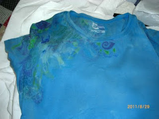
Okay, so here is the end result. I couldn't locate the camera when I did the painting part. I think I didn't choose colors that contrasted enough with the original color of the shirt. You can see my glue design but it's faint. I think if the shirt had been lighter or white it would have turned out more pronounced.
This is the back of the shirt. It came out a bit better than the front. I'm going to try this again on a white shirt next time.


No comments:
Post a Comment